Showing posts with label illustration. Show all posts

Monday, June 15, 2015

TEDx Philadelphia 2015

TEDx Philadelphia 2015's host, Erica Atwood,
the only speaker I forgot to draw
It's been awhile since I felt I had anything important to write about here, but my experience at TEDx Philadelphia talks last week definitely deserve a post! I have watched a few talks on the TED website but seeing a whole day worth of talks (14 in all) was a different experience entirely. I wasn't familiar with any of the speakers before seeing them on the day of the conference, so I wasn't too sure what to expect. I was hoping for a few talks about Graphic Design or other art-related discipline, but the theme, "Justice for All" suggested otherwise, which was ok, I do realize there are more pressing issues in the world than picking the right font.

There was one talk about artwork made while incarcerated, and one about architecture, so art wasn't completely off the table, however, I was surprised to find I was more interested in other subjects discussed, such as being an openly gay preacher (I didn't know that was possible!), just how hard it is to break the cycle of poverty (with some pretty sobering statistics), and police brutality (spoken by Philadelphia's own chief of police, Charles H. Ramsey). Downstairs in the basement there was also an art show and a screen printing station were attendees could make their own 2 color screen print to take home with them, and two live musical guests, so don't worry creative people considering attending next year, you will get your art on :)

David Norse, Philadelphia first Openly Gay Preacher!
I bought a little 5 x 7 inch sketchbook with me with the idea that I would draw people in the audience during the talks - but ended up drawing the 14 speakers instead. Each talk was 18 minutes or less, so I worked quickly to try to capture each guest's likeness and pose during their speech, then add their ending quote & name.

Charles H. Ramsey, spoke about police brutality and other experiences
during his 46! years of working in law enforcement. Cool guy.


The short drawing time for each speaker meant I worked in pen with no chance to erase mistakes (which I made many!) and some line work that I would considered sloppy, however overall I was happy with how they turned out. I liked the speed of each drawing  - no time to second guess yourself or over think, just do it.
Yasmine Mustafa, former Persian Gulf War refugee & Entrepreneur

If you want to see all 14 drawings, you can check them out in my TEDxPHL15 Album on Flickr.

Thanks, TEDX Philadelphia, you've given me a lot to think about, I'll be back next year.....

Monday, April 13, 2015

High School Career Day: Becoming a Graphic Designer


Me, getting ready to show students my portfolio at Career Day
 Last week, I was invited to speak at Pennsauken's High School's Junior Career day about working as a Graphic Designer....my first thought was.., "when did I become an adult, let alone be qualified to talk to high school students about my career?!" I've actually been working as a Graphic Designer for over 10 (!) years now, which is a concept too crazy to comprehend. And it has been 15 years since I graduated high school, which makes me "so old", as a student so kindly pointed out after reading the dates written on the pages of my high school sketch book - hah!

Overall, it was a great experience and one that should be repeated at other high schools - so much of what we learn in high school may seem useless, but it actually could lead to a lifelong career. Many of the students asked great questions - ranging from, "how much money do graphic designers make?" to "where do you get inspiration?" and "do you ever get stuck and can't think of a new idea?" (the answer to that last question is "Yes!", everyone gets stuck sometimes, you just need to power through :).

I thought I'd share my journey from high school to graphic designer for anyone who might be thinking about it as a future career....

One of the first drawings in my high school sketchbook,
hands from freshman year.

From a very early age, I have always loved to draw. In school I won a few "art awards" in elementary & middle school and in addition to taking the required art classes in school, I also took classes in drawing and pottery at a local art center (Perkins Center for the Arts in Moorestown & Collingswood, NJ). In high school, I continued my love of drawing, taking various art classes as electives for all 4 years, as well as taking a figure drawing class outside of school (figure drawing = naked people, which was a shock to an immature 17 year old, however, it was a necessary skill and would be repeated during college, where I got very used to it!). As senior year drew to a close, I knew that I wanted to continue art in college, there was nothing else that I cared as strongly about, but felt I didn't have enough good pieces to put together a portfolio for college review and decided to go to community college first. Community college was a great (and inexpensive!) way to gain more experience - though in retrospect, I probably could have gone directly to art school as well, my portfolio was probably more than adequate for an incoming freshman. Anyway, one benefit of community college was taking all Art & English classes (my best subjects), gave me a high GPA, and I was inducted in the Phi Beta Kappa Honor society - which would have given me a very generous scholarship (at the time, perhaps even 100% of tuition), had I chosen to go to a state school such as Rutgers or Rowen University.

High school, sophomore year drawing,
small object drawn large - close up of a hair clip
But no, being a teenager with no understanding of how college loans would impact me for the next 10+ years of my life, I had my heart set on an expensive private art school, and ended up going to the University of the Arts in Philadelphia. I don't regret this decision, as UArts was an excellent school were I greatly improved my skills. My credits from community college were all accepted, though only as electives - not as major required classes, so while it lessened my credit load per semester (and got me out of taking Art History I), it didn't save me any time in getting my degree. At UArts, and I imagine, most other private art schools, all visual artists (this included graphic design, illustration, photography, film, animation, fibers, metal, sculpture, industrial design, glass blowing, pottery and any other major that wasn't performing arts, writing or communications), had to take the same freshman year "foundation program", then split off to their desired majors for sophomore year. "Foundation" consisted of basic drawing, painting, and sculpture classes, which could be more tedious then fun. Students who had drawing skills did relatively well, while others with talents in in an area that (seemly) didn't require drawing - like film and photography, often had to tough it out with lots of complaining. It was MUCH harder than my art classes at community college, and about 1/2 of the students in my freshman class didn't return for the second semester or sophomore year.

At the end of the foundation program, I was undecided as to whether I wanted to continue with graphic design or illustration. I met with the directors of both programs, and after learning that graphic design wouldn't require much drawing after the sophomore year, decided to go with illustration instead. I was still very drawn to computers, and followed a "digital track" in illustration. At the end of my time at UArts, my skills using the Adobe Creative Suite enabled me to find a job as a graphic designer fairly quickly, and I've been working continuously since. One of the benefits of graphic design is it can be much easier to find work directly out of school, while Illustration can take longer to get established - the average is about seven years. For me, it has been much easier to find graphic design jobs, and I work much more often as a graphic designer than as an illustrator - though I have also worked on projects that blurred the lines between both titles, and I have found being able to draw has given me a wonderful advantage in finding design work.

If you are thinking about going into graphic design or illustration (or are currently in college) check out my post on Tips for New Graphic Designer & Illustrators.

I'm looking forward to speaking at the next career day in the fall - it was a lot of fun!

Introducing myself to students, along with the other Art & Music professionals at Career Day.

Friday, February 13, 2015

Fair Trade Valentine's Cards - Free Download!


Happy Valentine's Day! I figured I better break my month long silence and share something....

This card I drew for Fair Trade Campaigns last year is available as a free download on their website here. It was created for customers to send to their favorite fair trade farmers & artisans.

Just for fun, here are 2 alternate versions that I loved, but sadly didn't get picked : ( I had an elaborate plan of making a different background for each of the fair trade industry they were trying to highlight: roses, coffee, chocolate, plus a "generic" square version that could be used for other products, but they wanted to go with something simpler. The coffee & generic versions are shown below.


Do you have a favorite fair trade product? Mine is definitely CHOCOLATE - I have to have a bar at my desk at all times - it helps me work!


Wednesday, October 1, 2014

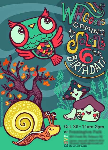
Fall Owl Birthday Invitation


After my social media class last month, I've been *trying* to post more regularly on this blog, so I'm going to share this invitation I recently made. I'm breaking my former rule of only sharing work after the event has passed, and in this case, before some of the invites were even mailed ;)

I usually make a Halloween themed invite for her birthday every year, but this time decided to go with some fall woodland creatures. She is obsessed with snails, so I had to include one. The mushrooms & owl were my personal choosing, but I did ask what color she wanted them to be and she said "Rainbow!".

So here is my attempt at a "rainbow" fall color scheme. I think it came out OK, but has some room for improvement, so I will be re-coloring with 2 different schemes in the next couple weeks.

As I was inking the owl, I had a major case of dejavue, "I feel like I've drawn this owl before.....". Because as it turns out, I have, more than once. So much so, I've made a blog label for them.

Sunday, July 20, 2014

Rustic Wedding Save the Date Postcard


It seems like EVERYONE I know is getting married this year - I've been to 5 weddings already in 2014. Please slow down friends, or I will be completely out of money ;). But on a positive note, it also means I've been working on several wedding related projects and they are so much fun. I really love the "Rustic" wedding look that's popular right now.

This save the date wedding postcard was made to include the future bride & groom and their four (very loved) pets, two labradoodles and 2 cats.  The bride wanted a simple line drawing in the spirit of Life is Good characters. I drew them a bit more detailed, but still kept it simple and I really like the way it turned out. I just got my printed sample, and was incredibly happy to discover that the colors printed as vibrant as they were on my screen, and the quality was fantastic. I'm thinking of making this a customizable card option (choose how the bride and groom and any pets look) once I get my store section of my new site up, which is still a few months away but in the works!

Friday, April 18, 2014

Lower Moreland Township Flag

Last month, I finished up working on flag design for Lower Moreland Township, PA. For this project, I went through a few different rounds of unsuccessful vector-based designs before going to the pencil drawing that was eventually chosen.  


I don't work on realistic drawings of houses very often, so this was a nice little project for me. The flag will hang on posts in their downtown, and I am looking forward to seeing them in person once they are up!

Thursday, March 27, 2014

Kate Moross : Make Your Own Luck : Graphic Design & Illustration Lecture


Last night, I attended AIGA Philly's Lecture with Kate Moross, entitled Make Your Own Luck. The event was held at CHAD (Charter High School for Architecture + Design), so as a bonus I got to check out some of the senior work on display before the lecture started. It took me back to my own high school art classes ~ though if I had gone to a High School especially for design, I would have had a MUCH better time ;)


CHAD Student Work : My favorite self portrait -great colors!

CHAD Student Work: Look closely - the beautiful pattern on this purse is also the artist's initials - AB!
Kate's lecture was very entertaining, though it wasn't quite what I expected. She talked a little bit in the beginning about how she started off as a very young designer and how she eventually built up to paying gigs, but the majority of her talk focused on how she had moved on to making music videos, both using film and rotoscope (a technique where illustrations are drawn over film stills - if you've seen the film Waking Life, you know what I'm talking about). While she didn't talk specifically on "how to make it" in the graphic design/illustration world, it was obvious that she had become successful by being bold, social, working non-stop, and not limiting herself to one style or medium (like her move from design to film). Kate said that if she ever found herself not knowing how to do something, she would simply look up a tutorial on the internet and/or hire someone that could do it better than her.


Kate Moross sharing the concept sketches she made for a rotoscope music video featuring Disclosure and Mary J. Blige
Though I was slightly disappointed there wasn't more "How to make it" advice (she did say she had toned down that aspect of her lecture because she mistakenly thought the AIGA crowd would be old & not interested in that part, haha), her work and tireless enthusiasm was incredibly inspiring, and there was some really good music. I also bought a copy of her book: Make Your Own Luck: A DIY Attitude to Graphic Design and Illustration, which talks about all the subjects I missed in her lecture. I am only about 1/2 way through, but so far enjoying it. It is very nicely designed, has great colors and very gorgeous paper for the cover and pages. You can buy it on Amazon after March 31, 2014.

So now, freshly inspired, it's back to the drawing board (literally) as I work on a new side for my business.....I just need to be more brave.....here I go......   

Friday, January 10, 2014

Hipster Wedding Invitation with Mason Jar!


I shared a sneak peak of the caricature I drew for this wedding invitation on facebook last month, and now that the wedding is passed, I figured I should show the rest of the invite.

I drew this for an old friend who was getting married quickly, but had very specific goals for her invitation: unique, retro, & printed on recycled paper


While it would have been easy to make a flat 5x7 card and call it a day, this was their wedding, afterall, and I wanted to make something a little more special. I settled pretty early on a caricature of the couple, and thought it would be cool to have a little die-cut action, but didn't want to get too crazy, as I would be cutting them by hand. So I compromised with a modified circle shape which would fit the hands on the front side, and their heads on the reverse. The result was a card that opened horizontally, but still fit into a (recylced) 5x7 envelope - I was really happy with the way it turned out!


Tuesday, August 14, 2012

GO Bananas for Fair Trade Campaign

GO Bananas Facebook Timeline Photo
It was a few months in the making, but the Go Bananas For Fair Trade Campaign I worked so hard on is finally live! For this project, I got to design and illustrate the logo, spot illustrations and all the promotional materials: 16 page tool kit, banana cutout, Facebook & web banners, poster & Powerpoint template - whew!

It was nice to use BOTH my illustration AND design skills on this project, hopefully I can do more work like this in the future - I really love to draw and don't get to do it professionally as much as I'd like (though I am going to be changing this in the next few months!).

To start the project off, my first job was to create the logo
Go Bananas for Fair Trade Logo


Next, I drew some spot illustrations & borders to be used on the website and campaign materials. These were done in illustrator, because vector art is so incredibly clean & useful in this type of project.

I don't think I need to mention that this was my favorite part of the entire project, hehe.

The biggest part of the campaign pack was the 16 page, text -heavy "Toolkit".

                          (cover)                                    (interior page)

 Then some web & facebook banners

(ooh, look, animation! Super easy to do in Photoshop!)


(facebook timeline photo)

A Poster

........And powerpoint templates.


If you'd like to see the Toolkit (or anything else in its entirety) everything is available to download from the Resources section of the Go Bananas website.


Saturday, March 31, 2012

Art House Co-op - 4x6 Exchange


In the beginning of March, I was lucky enough to snag a spot in Art House Co-op's 4x6 Exchange. Art House Co-op is the fantastic organization behind the Sketchbook Project (which I also participated in this year -can't wait for the tour!...). If you're a creative-minded person, whether it be through art or writing, I urge you to check out their website and follow them on facebook or twitter. They are constantly announcing new free projects to turn on your creative brain.

For this project, I had to create a 4” x 6” inch, flat artwork then mail it and a self-addressed, stamped envelope to Art House in Brooklyn. In return, they will exchange my work with another artist’s submission and mail it to me...ah, the element of surprise...

So for my project, I decided I would make a peacock. I think they were really "IN" last summer, so I'm operating a good 9 months behind the rest of you trend-setters. I also still wear jeggings.....and I'm considering reading Twilight.

 I made my pencil drawing on a piece of matte board, you can see my 1 and only rough sketch in the background. I wanted to color it with some really light pigments and let the pencil drawing show thorough. If I hadn't professed a deep hatred for watercolor and given away all the expensive paints I was forced to buy for school, then watercolor would have been perfect. Also, gouache would probably have been perfect, except I have no idea what that is.  

So, lacking watercolor and gouache, I decided I'd try some super-thinned acrylic paint and try to achieve the same effect. I left the drawing on the desk for a few minutes while I went to get my paints. 

When I got back, I found this.....

My 5 year old decided she needed to color in the peacock for me, even though I had asked her not to touch it. I'm not going to lie, I was mad and I yelled at her. Then I felt horrible for crushing her creative efforts and apologized. But I couldn't cover this up with thinned paint. I debated drawing a new peacock, but lack of time triumphed over my former artistic vision. So on to plan B....

Glitter Pens.

Yes, I know they look like they are made for pre-teen girls, I'm not even sure why I own them. I probably needed to write "I love Justin Bieber" on my trapperkeeper or something. But they write really nice and smooth, they covered the scribbles (can you see them?) and they *sparkle* (hard to see through the computer).

I mailed this off today and will be anxiously awaiting my exchange. You can also see it on the Art House site here.

Tuesday, October 25, 2011

Halloween Party Invite


I couldn't let October end without acknowledging Halloween, my absolute favorite holiday to design products for (and sadly, who's glory is short-lived, to be quickly overshadowed by Christmas). Black, orange, purple, creepy characters, black cats...love it!

This is the invite I made for my daughter's Birthday this month, it's not too scary for a 3 year old's party, right??

 I made the front illustration in Illustrator, but wasn't happy with it, so I decided to try something new, and take the file into Photoshop to add some textures and effects.


here's my illustrator file:

(ahhhh! shield your eyes, it's hideous!)


And here it is, post-photoshop magic:


This is the original inside, scrapped because it was too hard to read and would waste way too much printer ink:


And the final inside:


To save time, I used a free, vector "frame" from Vecteezy for the inside. Sometimes, there is just not enough time to draw each and every element, that's when graphic designer Lauren takes over :) I loved this particular border and you can't argue with free. 


Sunday, August 14, 2011

Baby Shower Invite


Okay, here it is...the previous sneak peak....

....A baby shower invite for my lovely sister (who is due this week with a long-awaited little girl! ah, hurry up, lil' Sara Jr! I want to hold you!!).

I really loved the way this turned out and was so happy to finally show it to her 2 weeks ago (the party was a surprise).

In addition to the card, I also make a matching "shopping list" to include in card and matching candy bars as a shower favor.   

The complete set is shown below (can you tell I love branding?? hehe).


Saturday, July 30, 2011

Updates and a Sneak Peak

Ahhh, summer. I'm enjoying you so much, even if you make me lazy with posting on the blog, or working on art in general, hehe. But I have been working on some freelance jobs which I hope to finishing up soon, and I have 2 BIG projects starting in August with I'm pretty excited about :)

One is for Fair Trade USA, and while it doesn't require too much creativity, I am incredibly happy because it is for a fabulous environmental sustainability company, which is a cause very near to my heart. (And I don't want to get off topic, but my design skills were recently featured in this article about the earth-friendly arts movement, check it out!) 

I just finished a project which I am so very in love with, it pains me that I cannot share it before it goes "live". Argh!!! It's so darn cute, I can't stop staring at it (this is a rare thing, usually by the time I finish a illustration I have been starting at it so long that I hate it :)). So because I can't help myself, and because I don't think it's possible to post on a design blog without a picture, here's a sneak peak......


Wednesday, February 16, 2011

Kids Animal Themed Snowboard Art

Dear Burton; I love you, I own all your gear, but your board design are a bit, uh...boring. You may think the graphic doesn't matter to people when they are buying a new board, but every snowboarder I've talked to has said otherwise. So here is my suggestion for some great art for your kid's line. 


Love,

Lauren

Saturday, December 18, 2010

Be kind to the Earth.....Use Cloth Diapers!

I'm a BIG cloth diaper supporter -it's the only load of laundry I LOVE washing & hanging out to dry :)) My second child has been cloth diapered from 3 months - 2 years, and we have used the same diapers the entire time and they are still going strong! Currently we've begun potty training and I'm a bit sad because the cloth diapers will soon be packed away, awww. 

So here is my public service announcement poster - Use Cloth diapers! 
Related Posts Plugin for WordPress, Blogger...