Once again I've taken an extended vacation from blogging (but it is summer, afterall ;), so I'll be playing catch-up these next few weeks while I update with some recent projects.
This is a two sided postcard I designed for Continental Studios, which was sent out to all their high school & college customers to remind them to buy their senior portraits.
I really love the yellow-gray color combo that's popular right now, and it works perfect as a gender-neutral scheme for this card.
Showing posts with label text. Show all posts
Thursday, August 15, 2013
Wednesday, March 13, 2013
Using Dingbats as a Source of Free Illustrations
![]() |
| Made Using "Butterflies" font by Typeadelic |
Because fonts work similarly to vector art, you can scale the art to any size and they will still look crisp and sharp. They work best as one-color line art, but if you want to add more color to them, you can "Rasterize Type" in Photoshop or "Convert to Outlines" in Illustrator and use the paint bucket or direct selection tools to color them in.
![]() | ||||||
| Volkswagen Font from dafont.com, fun! |
![]() |
| "Floralia" font from FontSquirrel.com |
Sunday, April 15, 2012
A quickie hand-lettered flyer
A couple of weeks ago, I designed a flyer for a clothing swap I am hosting through Yogawood. I was proud of myself for completing the entire thing from start to finish in less than 90 minutes in between the end of work and the start of the House Industries lecture. Then, I went to the House Industries lecture, saw their hand lettering, and was immediately humbled. This is a good thing, because seeing amazing work makes me strive to be better on my own projects.
I'm going to share my process, because it's a good abridged version of how I would work on a bigger job.
1) START WITH A SKETCH:
Before I do any computer work, I always start with sketches, to work out any inner demons and organize my brain. These pre-sketches are ROUGH, and normally would never seen by anyone but myself.
2) REFINE:
I have a general idea of how I want the title to look, but it needs to be worked out a bit, so I worked on some slightly different comps. I would usually do 4-6 pages of different ideas over the course of a few days, but again, this is a quick job so I focused on 1 concept.
3) ENLARGE & REFINE:
Okay, I've found a design that I like, but it's a teeny tiny 1 inch drawing, and I need it to fit on a 8.5 x 11 inch flyer, so I scan it into the computer, enlarge it, then print it out the size that I want. Except it's a grainy mess, so I need to work on it again. I would usually use tracing paper for this part, except I was at work, and had none. So in a pinch, I used the window as a giant light table, and it worked really well! I'm used black micron pens of various point size to trace over the drawing.
4) COMPUTER CLEAN-UP:
While my sketch is way better than it was, it's still a little messy, at this point I scan it back into the computer and fix any sloppy line work.
5) COLOR:
I don't even started to think about color until I have the logo design down. You don't want to confuse yourself. At this point I have generally have an idea of some colors that I think would work well, but I'm open to suggestions. So I head over to colour lovers and do a palette search using a color or theme I'd like to see. I forget the exact term I used, but here are some potential palettes I liked.
I color all my projects digitally, and for logos I would normally vectorize & use Illustrator, but this is a fast job, so I keep it bitmap & colored in Photoshop .
6) TEXT LAYOUT:
I do this part using Photoshop, or inDesign, depending on the project. I use the guideline and paragraph alignment tools to make sure everything is laid out in a professional way.
SHAMELESS PLUG: If you are a woman & live nearby, please come to the swap on May 6th! Clothing Swaps are so much fun, and I promise you will leave with some awesome new finds. Also, it's FREE, just bring a canned food donation for the Food Bank of South Jersey.You can sign up on facebook here or on the yogawood special events page here so we have a general idea of how many people to expect!
Monday, April 9, 2012
House Industries Lecture
I was so psyched to attend the recent Philly AIGA House Industries lecture. I spent most of my college years lusting after the fonts in their beautifully designed catalogs, so it was incredibly amazing to see them in person. They are seriously the rockstars of type. (please excuse crappy photos taken by my cell phone in low light, they don't do their work justice!)
![]() |
| Rockstar poster design by House Industries for John Mayer! |
The main focus of the lecture was to introduce their photo lettering service - PLINC. Instead of buying an entire font, you can now buy a custom "type setting" of up to 40 characters, (not including spaces) for just $7 (and potentially less if you sign up for a subscription to the service). Best of all, the type comes with few restrictions, meaning you can use it FOR ALMOST ANYTHING - making it perfect for logos, headlines, or where ever else you might need a unique font.
Below is a shot of PLINC in action:
But wait, there's more! From now until April 15, you can download 3 type settings for FREE, using coupon code PHILLY (do I sound like an infomercial yet? ;)
For more information on how PLINC works, click here. If I've already convinced you it's the greatest thing since Photoshop, then start using it now.
-If you are not already familiar with House Industries, prepare to be awed by their amazing work. And sign up for a catalog and some free fonts while your at it!
Thursday, September 22, 2011
2012 Calendar
It's a little scary to be thinking about 2012 already...when I just got used to writing 2011 on all my checks :)
It's also hard to believe that this is my 4th year designing a calendar for the Wissahickon Charter School (an eco-centered learning community here in Philadelphia). This calendar features art from the school's wonderfully talented students, ages kindergarten to 7th grade and is sold as a fundraiser for the school.
They as sell a notecard pack - with 10 different cards featuring more talented artists from the school.
Please click here to find out more ways you can support the wonderful school.
Monday, September 12, 2011
Fair Trade USA Program Book
I got to work quite a bit in InDesign last month (InDesign is a cousin of Photoshop, but it is mostly for multi-page text layouts), and actually enjoyed myself. I'll admit it, if I had a choice between drawing some cute, happy animals and laying out a 24 page catalog, I would pick the cute animals :) BUT- there is also something nice about using simple, clean design to organize text so that it can be read easily, especially if it's for a cause near and dear to my heart, like Fair Trade.
I designed this program booklet for the Fair Trade USA conference held this past weekend in Philadelphia, which was sponsored by wonderful, forward thinking companies like Ben & Jerry's, Ten Thousand Villages and Green Mountain Coffee.
I also volunteered at the conference and had a great time! I got to meet Ben Cohen of Ben and Jerry (he says his favorite flavor is Cherry Garcia and is best eaten with Newman's Own Chocolate Alphabet cookies, hehe). Here's me and my sister working the registration table.
Saturday, October 16, 2010
More SBN Work
I Love SBN, they feed my kids....
Design of Brochure for their FREE Greening your Office Workshop, which runs in the Philly area November 2010-March 2011
Invitation Design for their Green for Green fundraising reception, an amazing event to showcase an amazing Solar-powered house.
Wednesday, August 11, 2010
Back to School Products
I know summer is almost over, because I have been working on the 2011 Back to School line all month. Good riddance summer, I will be glad when I am free of your oppressive heat and random gangs of roving teens.
Friday, June 11, 2010
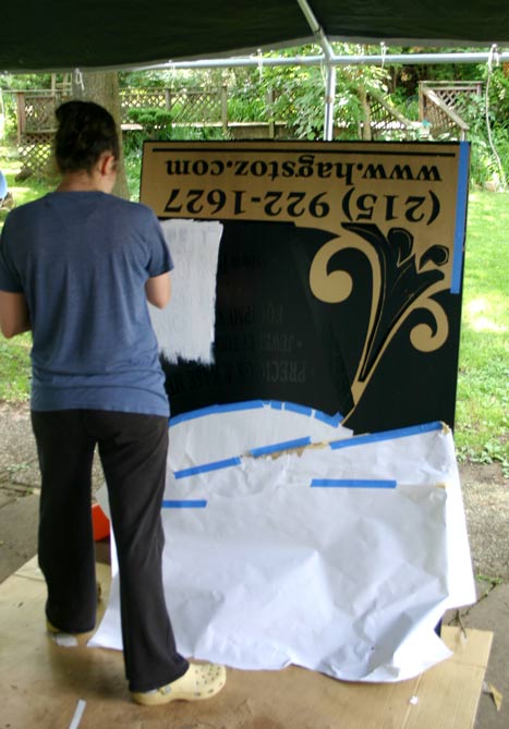
TB Hagstoz Sign Update
Three months ago, I shared with you a sign I had designed for the outside of the TB Hagstoz store on Jewelers Row in Philadelphia, PA. At the time, I had just finished the long, long process of finding a sign company to print the sign without going over the modest (as far as sign-making goes) budget. After meeting with owner of a particular sign shop, going over specs, choosing materials & uploading the design to their ftp site, I asked the owner if I could see a printed proof of the sign before they printed the full size one. This is when everything went downhill.... After acting confused as to why I might want to see how the colors would print before they made a huge 42 x 60 inch sign and bolted to the outside of a building, he said they didn't really print proofs, but okay fine, he would print it the next day and would call me to let me know when it was done....and that was the last I ever heard from him, ever. So on to Plan B.... Completely fed up with with the entire local sign industry, most of which I had to BEG to give me a price estimate, I decided, fine, if you don't want my business, I will paint the darn thing myself. And so, with the help of Loews, Sherwin Williams, Sheffield Bronze (who made the ONLY commercial grade gold metallic exterior paint I could find) & fabulous custom made vinyl stencils...i did.
the end.
Monday, April 19, 2010
Covers for Activity Pads
I have to take pleasure in ANY small job at work where I get to design something completely by myself... like the covers of these activity pads that will be sold at Fred's Stores next month...who-ho!
Tuesday, April 13, 2010
Handbill Design for Yogawood
Wow... I have been quite lucky this past month to be able to create designs for businesses near and dear to my heart.....like this handbill/coupon design for the newly opened Yogawood studio in Riverton, NJ.
If you are local to the area, you MUST check this place out! They have fabulous classes for new students and seasoned yogis alike. Plus, owners Beth & Lisa are two of the sweetest people in the world. Just send me an email at posterjunction dot gmail dot com and I can mail you out this coupon good for new students.
Tuesday, March 23, 2010
Business Sign Design
I have ventured into new design territory and created....my first ever....sign for the outside of a business! After the logo, this is probably the most important design a business can have, so it was such an honor and a challenge to create something eye-catching (and appropriate) for a 112 year old jewelry supply business located on historic Jeweler's row in Philadelphia, PA. The owners wanted a design featuring their trademark crucible and I chose to make the sign in the style of art nouveau (not only because, I am so very obsessed with art nouveau, but also because it was the style movement way back when the business started in 1898).
(the old sign, obviously in need of replacing)
(preliminary sketches)
(final design!!)
Wednesday, February 3, 2010
Logo Design and Promo Materials for Social Venture Institute
I recently had the honor of working with the fabulous people at the Sustainable Business Network of Philadelphia again (remember theses niffy reusable shopping bags??) , designing a logo and promotional materials for their annual Social Venture Institute.
Promotional materials designed included an ad in the February 2010 issue of GRID magazine, tri-fold brochure, and a program booklet to be handed out at the SVI conference. This was a great project, it is always an honor to design a logo, especially for a green Philly company :))
(Trifold Brochure Front & Inside)
(SVI AD in Grid Magazine)
Monday, January 4, 2010
Soccer Sports Book
I have been a busy, busy bee designing these last few weeks, not just for gifts, or my regular (boring) job but also some fun freelance projects. Where do I find the time? Well, I certainly don't waste any precious moments of my day cleaning my house, hah hah.
One of my freelance jobs was designing a 12 page, personalized sports book for Pros Digital, a photography company that specializes in "Showcase publication for elite athletic teams personalized for individual athletes".
.....which means they photograph your child throughout their sport season & make these nifty, 8.5 x 11 inch personalized photo books.
If only this product existed back in my soccer days....I could have an entire book filled with various shots of me sitting on the bench to cherish for the rest of my life.....
One of my freelance jobs was designing a 12 page, personalized sports book for Pros Digital, a photography company that specializes in "Showcase publication for elite athletic teams personalized for individual athletes".
.....which means they photograph your child throughout their sport season & make these nifty, 8.5 x 11 inch personalized photo books.
If only this product existed back in my soccer days....I could have an entire book filled with various shots of me sitting on the bench to cherish for the rest of my life.....
Thursday, December 31, 2009
Personalized Photo Calendar
Every year I decide I will make everyone's Christmas gifts, and every year I tell myself it will only take a couple hours (when it really takes 10), every year I freak out when I run out of time, ask why, oh why did I ever think this was a good idea, followed by the vow: I will never do this again....
Fast forward one year, repeat. :)
This was one of those nightmare gifts that took waay longer than anticipated, not only because of design time, but also because I was fighting with the printer for 90 minutes, and just could not figure out how to get it to print properly double sided on 11 x17 paper. I've designed & printed catalogs many times and never had a problem, but the printer techs at my work changed something on the machines and all my saving setting no longer work....also, the printer may hate me.

Of course you can always get a photo calendar made at Snapfish, etc, but you don't have the ability to customize dates and put monthly "Fun Facts" like I did on this calendar (Selena's 3rd Birthday, Ross & Bridget's Anniversary, etc.).
So it was a labor of love, but worth it, since this is one gift that will actually get some use.
Fast forward one year, repeat. :)
This was one of those nightmare gifts that took waay longer than anticipated, not only because of design time, but also because I was fighting with the printer for 90 minutes, and just could not figure out how to get it to print properly double sided on 11 x17 paper. I've designed & printed catalogs many times and never had a problem, but the printer techs at my work changed something on the machines and all my saving setting no longer work....also, the printer may hate me.
Of course you can always get a photo calendar made at Snapfish, etc, but you don't have the ability to customize dates and put monthly "Fun Facts" like I did on this calendar (Selena's 3rd Birthday, Ross & Bridget's Anniversary, etc.).
So it was a labor of love, but worth it, since this is one gift that will actually get some use.
Monday, October 26, 2009
Spooky Wine Bottle Labels
These are some fun wine bottle labels I designed at work for Halloween 2010. Text & Design Layouts done by me, illustrations from iStock.
Sadly, even though I am trained as an illustrator and would LOVE to draw my own illustrations for projects like this, I am rarely given the opportunity because of the amount of time it takes......I could spend a few hours making some vector art, or I could spend a few minutes and download some "good enough" art from iStock. Which do you think my boss prefers???
And if you are an illustrator, looking into submitting to iStock, please reconsider! They pay you a ridiculously low comission, like 10 cents (YES, 10 CENTS!) every time someone downloads your art, while charging the downloader $10- $20. Oh, It's a sad, sad time to be an illustrator with $16K of student loan debt
Sadly, even though I am trained as an illustrator and would LOVE to draw my own illustrations for projects like this, I am rarely given the opportunity because of the amount of time it takes......I could spend a few hours making some vector art, or I could spend a few minutes and download some "good enough" art from iStock. Which do you think my boss prefers???
And if you are an illustrator, looking into submitting to iStock, please reconsider! They pay you a ridiculously low comission, like 10 cents (YES, 10 CENTS!) every time someone downloads your art, while charging the downloader $10- $20. Oh, It's a sad, sad time to be an illustrator with $16K of student loan debt
On that note, Happy Halloween!!
Subscribe to:
Posts (Atom)